Great Falls has many issues, as any town does. However one issue that people tend to overlook is how we present ourselves. This plays an integral role in how others outside of Great Falls–and even outside of the state–see us as a city.
Our major outside presentation is our city logo, which is in dire need of an update. Forgone structures, incorrect illustrations, and a style out of time all contribute to this now outdated logo that we continue to use on the city website, city documents, and public gatherings.
It is time for change, whether you like it or not.
At a first glance, the logo has one attribute that must go. Yes, that is the smokestack. The logo is supposed to be a representation of who we are and who we strive to be, not a representation of what Great Falls used to be.
History, however, is important, and that we should not throw out. Instead of the smokestack, something should represent our past that is still here as an icon, whether it be the historic tenth street bridge, or the monumental Milwaukee Station Tower, or both.
It is time to move forward.
Speaking of moving forward, the river in our current logo speaks volumes of how we as a city really want to move backward and stay in our past. This is because the river is, yes, moving right to left, backwards, in the incorrect direction. This incorrect representation shows people that Great Falls is not even willing to try and move forward.
In an updated version of the logo, it would make more sense to show the river moving left to right, as if reading a book, showing that we know and acknowledge our past, but are no longer willing to stay in stagnant waters.

Montana is a mountainous state–obviously–and the logo should include mountains. But Great Falls is not a mountainous city. The focus here is not the mountains. The mountain front can be seen from a distance on a good day from many vantage points in the city. They often appear in between Gore and Skyline hills.
An accurate illustration of Great Falls’ geography–not Ulm’s–is an accurate way to show others what our appearance as a city is. It is a great way to convey that we understand what is accurately wrong with our city, and that we can achieve more by acknowledging our issues.
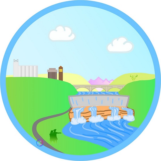
The mockup version of a new logo is shown here, just to demonstrate an idea of what I personally believe would serve our city best, here and now.
This piece was not created to slander the artwork made decades ago, as back then, it was an accurate descriptor for Great Falls: a city stuck in the past. But the identity of this city has changed.
Great Falls is starting to find a vision of itself in the future. There is a lot of work to be done, but it is time to acknowledge that we are ready to move forward, and tackle our issues head on.
And we need new imagery to help others see this new vision


Alex, I am so glad to see people trying for change in Great Falls now. How people view GF from elsewhere in the state and even out of state is going to be a huge hurdle that changing the logo is barely a starting point. I lived there for 3 years and in that time, the only change I ever saw was the TEEN CLUB NIGHT that I put together. After I moved, there was one additional change. The Snow and Ice Removal Plan… Which I also called the city out, prompting the change. To change how people view the city of Great Falls is going to take so much more action. I would love to see more changes happen there since my son still lives there and I want nothing but good things for him. But changing the City Logo isn’t going to make the difference you think it will. Take more action. Real action. With the right people, you CAN change how the world views the city. Think big! Good luck!
The problem with the current city logo is that it tries to combine six different ideas into one logo.